Murrieta Hot Springs Resort
A Modern Oasis of Wellbeing
Murrieta, CA
SERVICES
Brand DNA
Verbal Identity
Visual Identity
F&B Naming
F&B Branding
Collateral Design
Property Photography: Bri Amato
Drone Photography: Kevin Eassa
The Brief
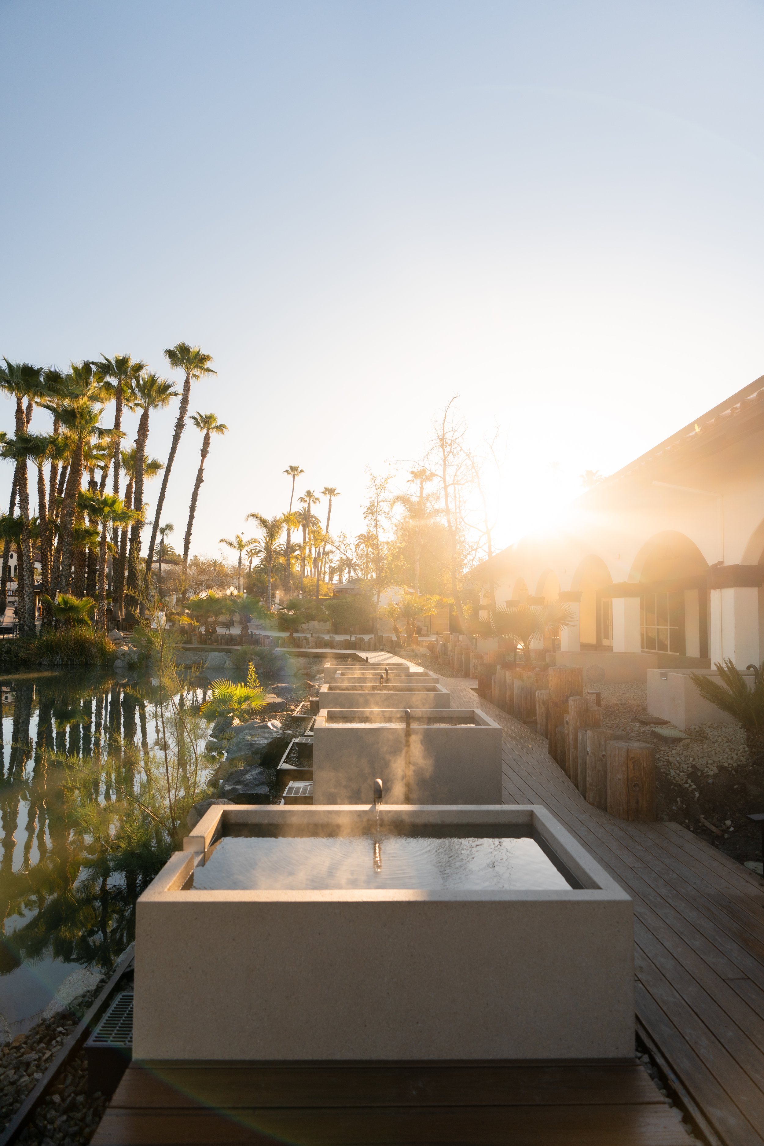
An historic gem located in the heart of Temecula Valley, CA, Murrieta Hot Springs Resort has a rich heritage dating back to its original opening in 1902. Under new ownership, the property was extensively restored to its original vision as a premier wellness resort in 2023. Maintaining much of the original Mission Revival-style architecture and landscape design, a cohesive and compelling brand identity for the property was needed to capture the resort's unique essence, while fostering the vision for its next chapter. A new brand DNA clearly articulated the resort's positioning, brand pillars, persona, and tone of voice, while a proprietary visual identity was designed to convey the thoughtful and intentional experience offered by the resort. Rooted in colors found across the property's landscape, simple shapes, and hieroglyphic-like symbols, the brand identity is centered around the resort's natural geothermal waters and longstanding tradition of rejuvenation. This not only honored the resort's historical roots, but also positioned it as a modern sanctuary of well-being. As a result, MHSR now stands out in the wellness resort market, inviting guests to embark on a transformative journey of vitality and restoration. The comprehensive branding set the stage for the resort's re-opening, promising guests a revitalizing and immersive experience steeped in history and natural beauty.
BRAND DEVELOPMENT
Working from a rich archive of historical photographs and documents, the visual identity blends eclectic and slightly retro elements with sleek sophistication and a modern charm that feels light, fresh and approachable.
CUSTOM WORDMARK
A custom wordmark was inspired by ancient Latin letterforms and Egyptian hieroglyphs that feel chiseled out of rock, and evoke a timeless, ancient wisdom. With a nice contrast between thick and thin variations in the letterforms, the wordmark also captures playful moments that convey movement and reflection—a subtle nod to the rise and fall of gently lapping waves, and the yin and yang of progress.
BRAND ICON
A unique brand icon was inspired by the property’s original wrought iron banisters and metalwork. The modern interpretation places water at the center of the mark, reflecting the property’s dedicated focus on the natural geothermal springs, which is enveloped by the resort's four guiding principles: revitalization, activity, sleep and nutrition.
COLOR PALETTE
The brand color palette is rich, earthy and robust—providing flexibility through a variety of color combinations—and was meticulously pulled from architectural details and natural landscaping found on and around the property.
NAMING
Carbonate also provided naming for three of the property's food & beverage concepts including Talia, the resort's signature dining destination, whose name means by the water; Café Azuli, an all day outdoor cafe, whose name was inspired by Lapis Lazuli, a gemstone known for its deep blue color; and Tortoise Shell, a poolside bar that honors the tortoise as a symbol of long life, endurance, and wisdom.
TALIA


